

Logo Usage Guidelines
The Innovation Council logo is an important expression of its brand identity. By applying the wordmark and the symbol in a consistent manner, the recognition and visibility of the brand is strengthened. These few simple rules will help you use the logo, wordmark, and symbol to communicate the brand most effectively.
Logo Anatomy
The logo consists of a symbol and a wordmark. The symbol and the wordmark can be used together or the symbol can be used independently.
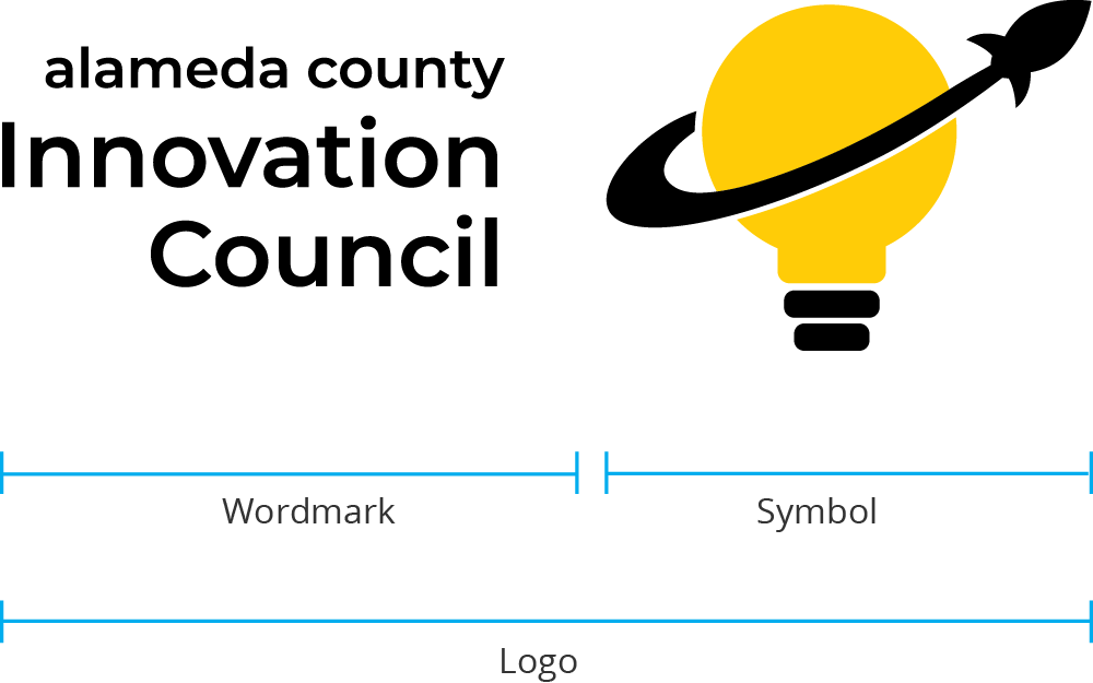
he Alameda County Innovation Council Logo
This is the AC Innovation Council logo, It is the primary graphic device and should be the first choice when choosing a graphic element to represent the brand.
Primary

Digital: 50 pixels
Print: .75 inches
Secondary

Minimum Height
Digital: 100 pixels
Print: 1 inch
Symbol Only
Digital: 25 pixels
Print: .3 inches
Logo Clearance
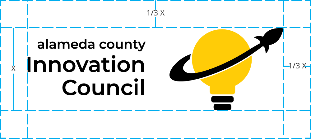
When using the logo in a design or placing it next to other visual elements, it should have plenty of room to breathe. This maximizes the visibility & impact of the logo. The minimum amount of space that the logo must have on all sides is 1/3 the height of the symbol.
For example: If the logo is sized 120px tall, there should be at least 40px of clearspace on all sides.
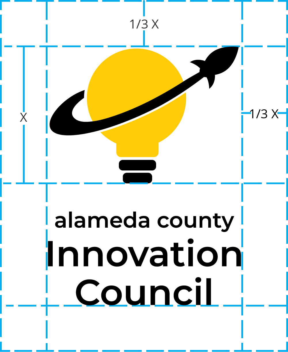
If symbol is used alone, the minimum amount of space on all sides is 1/3 the height of the symbol.
For example: If the logo is sized 60px tall, there should be at least 20px of clearspace on all sides.
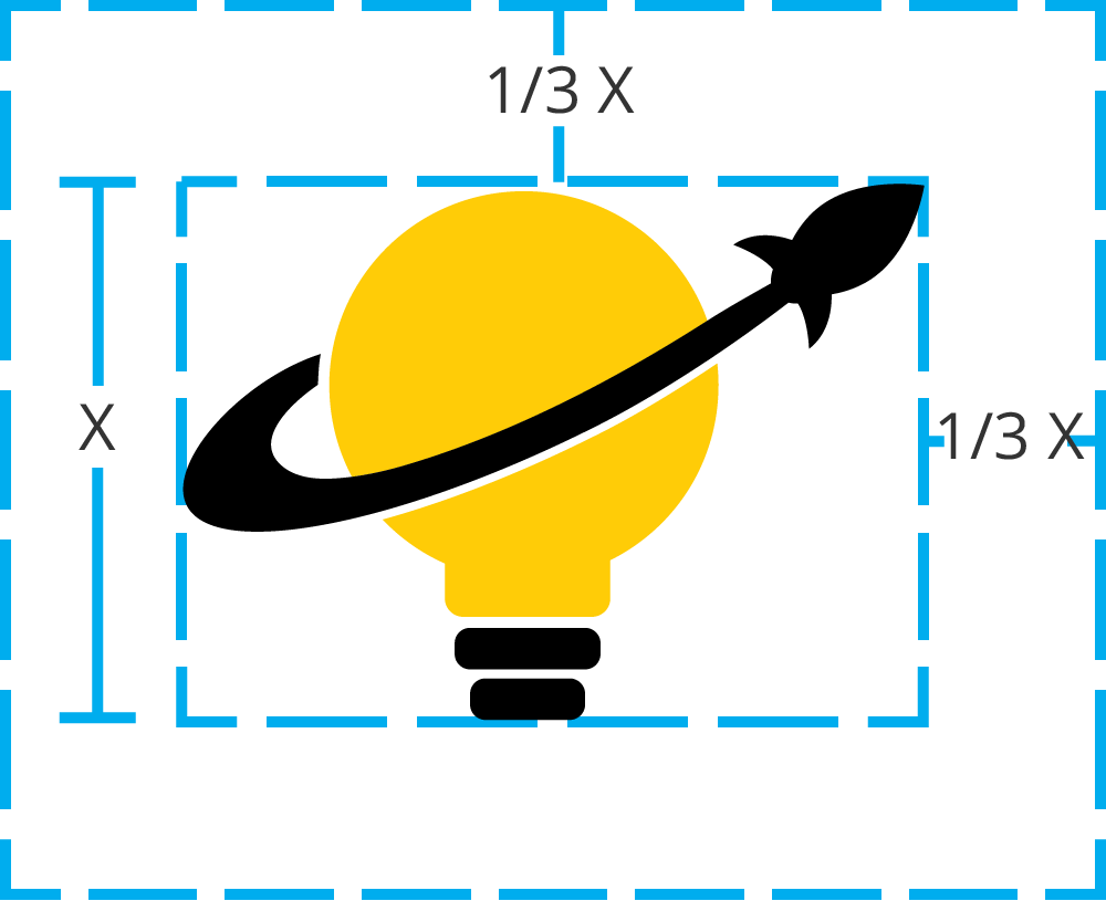
Logo Margins
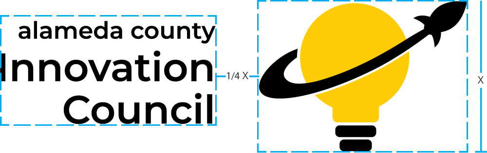
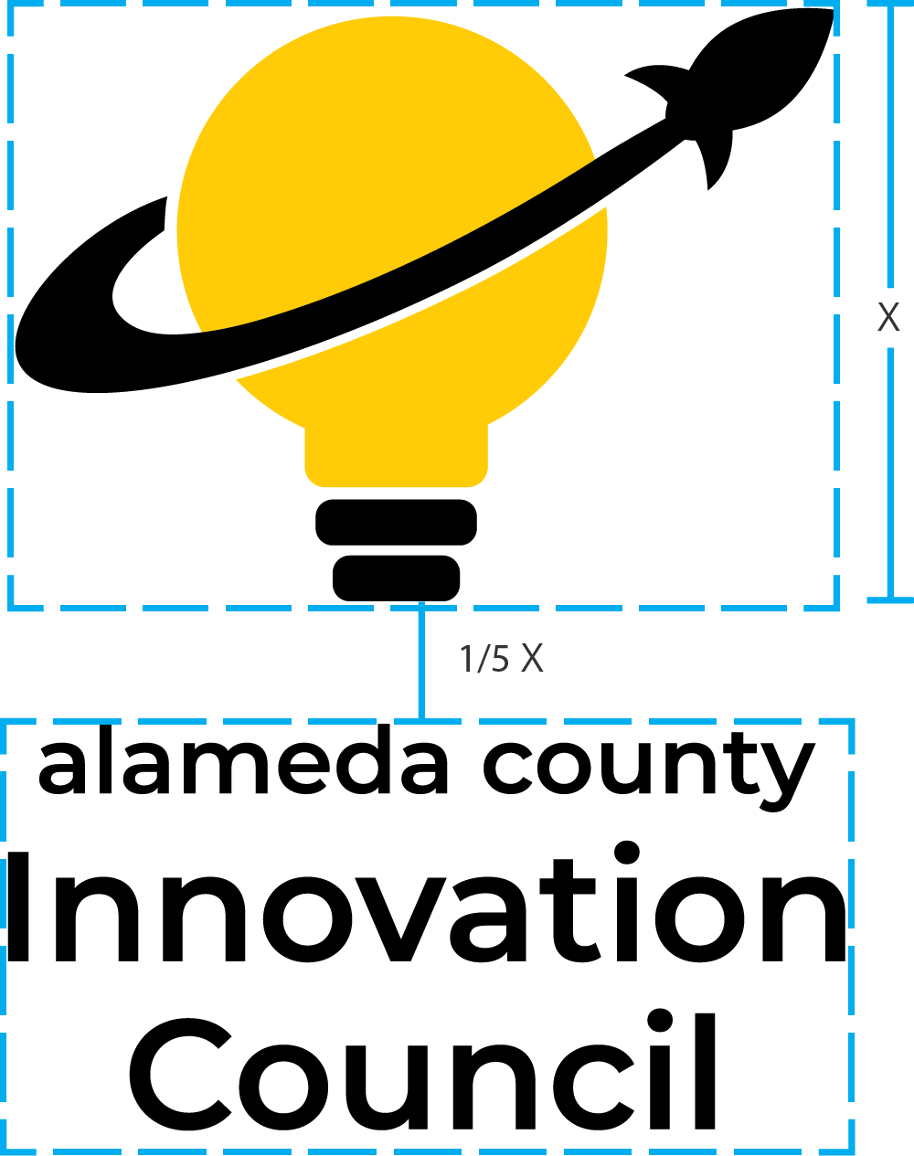
Do not alter the spacing between the symbol and the wordmark. The distance between the symbol and the wordmark is 1/4 the height of the symbol, 1/5 when stacked.
For example: If the symbol is sized 100px tall, there should be 25px horizontally between the symbol and the wordmark.
Color
The primary logo uses 2 colors. When using the color logo, these should be applied across communications to uphold brand consistency.
#000000
CMYK 0, 0, 0, 100
#ffcc07
CMYK 0, 19, 100, 0
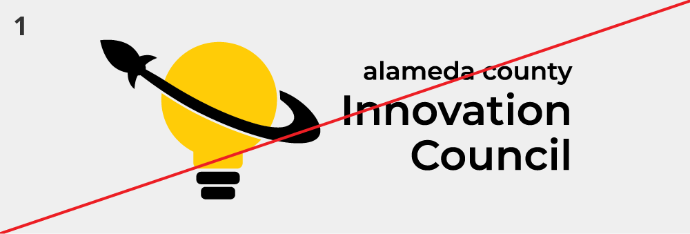
Incorrect Usage of Logo
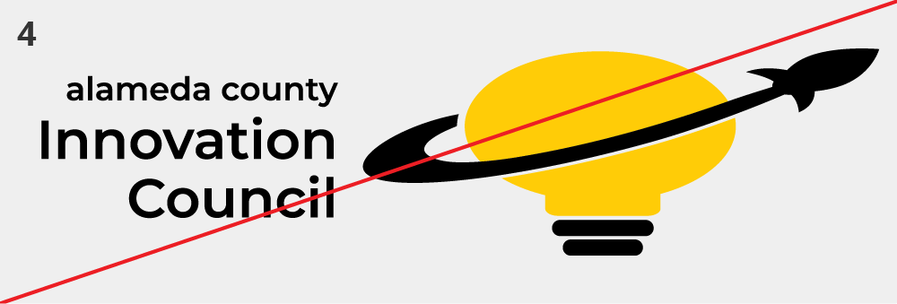
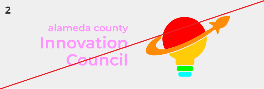
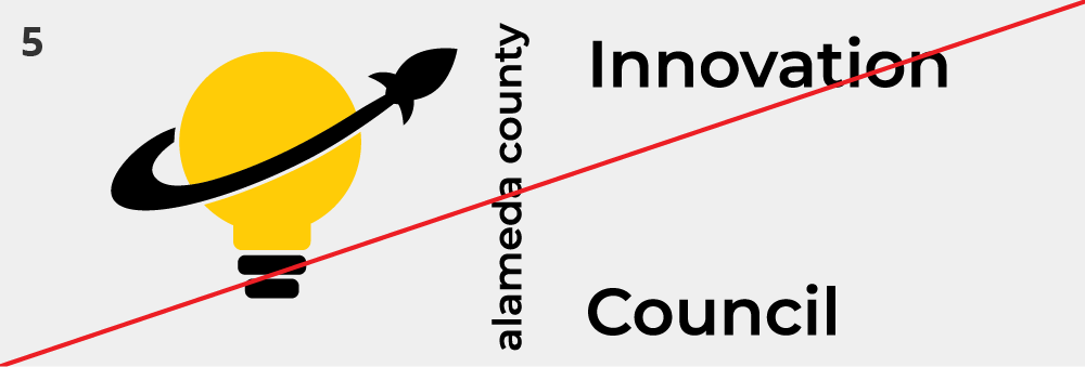
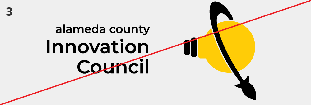
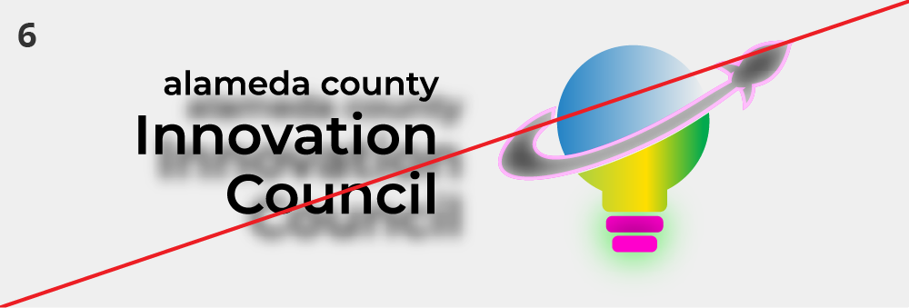
- Do not reverse logo.
- Do not apply other colors.
- Do not rotate any single part of the logo.
- Do not stretch or alter the proportions of the logo.
- Do not change the arrangement of the logo.
- Do not apply gradients, shadows, or other effects.
Inverted
These versions are to be used on black backgrounds. The same clearance, margin and usage rules apply.


Black and White Logos
These should only be used when it is not possible to use color.




Digital Accessibility
Digital accessibility involves designing and building websites, tools and technologies that allow access to all visitors, no matter what their abilities or disabilities.
ITD follows the Web Content Accessibility Guidelines (WCAG) 2.1, which are international standards that define how to make web content more accessible. WCAG only requires logos to have text alternatives. However, even though logos are exempt from other WCAG guidelines, ITD still strives to create designs that are accessible to all users, including those with disabilities.

Our goal with accessibility isn’t simply WCAG conformance but to present the best possible experience for users.
The ACIC logo follows these accessibility guidelines:
- The wordmark exceeds the minimum color contrast ratio of 3:1
- The wordmark uses a sans-serif font which has a slightly higher readability than serif fonts
- The logo mark is not too visually complex
When using logos digitally make sure to include an alternate text attribute:
Alt Text
To comply with the WCAG guidelines always provide text-alternatives when using any logo digitally.
For example:

Logos with a hyperlink
Logos often function as hyperlinks, following the best practice of linking to the homepage. It is important to use appropriate markup in the html to make it accessible. The link element (aka anchor tag) supports the function of naming from child content. The logo image is the child of the link, and so the alt text of the logo will become the text for the link. To be a meaningful link, the alt text should describe where the link will go.
For example:
<img src=”images/logo.png” alt=”Alameda County Innovative Council Homepage”></a>
If you are linking the logo in an older application or system that will not allow setting or changing the alt text of the logo image, you can fall back to using an aria-label attribute on the anchor tag. The aria-label attribute on an anchor tag will hide the child content (the image) from assistive technology and the aria-label value will become the text for the link.
For example:
<img src=”images/logo.png” alt=”Alameda County Innovative Council”></a>
If adding an aria-label is not possible, we suggest that you don’t place a link on the logo, and instead provide a text link.